Hand Lettering
& Illustration
Hand lettering is an important part of my creative practice, allowing me to explore typography in a more expressive and hands-on way. This collection features a mix of personal explorations, client work, and experimental projects that highlight my interest in crafting unique letterforms and illustration.
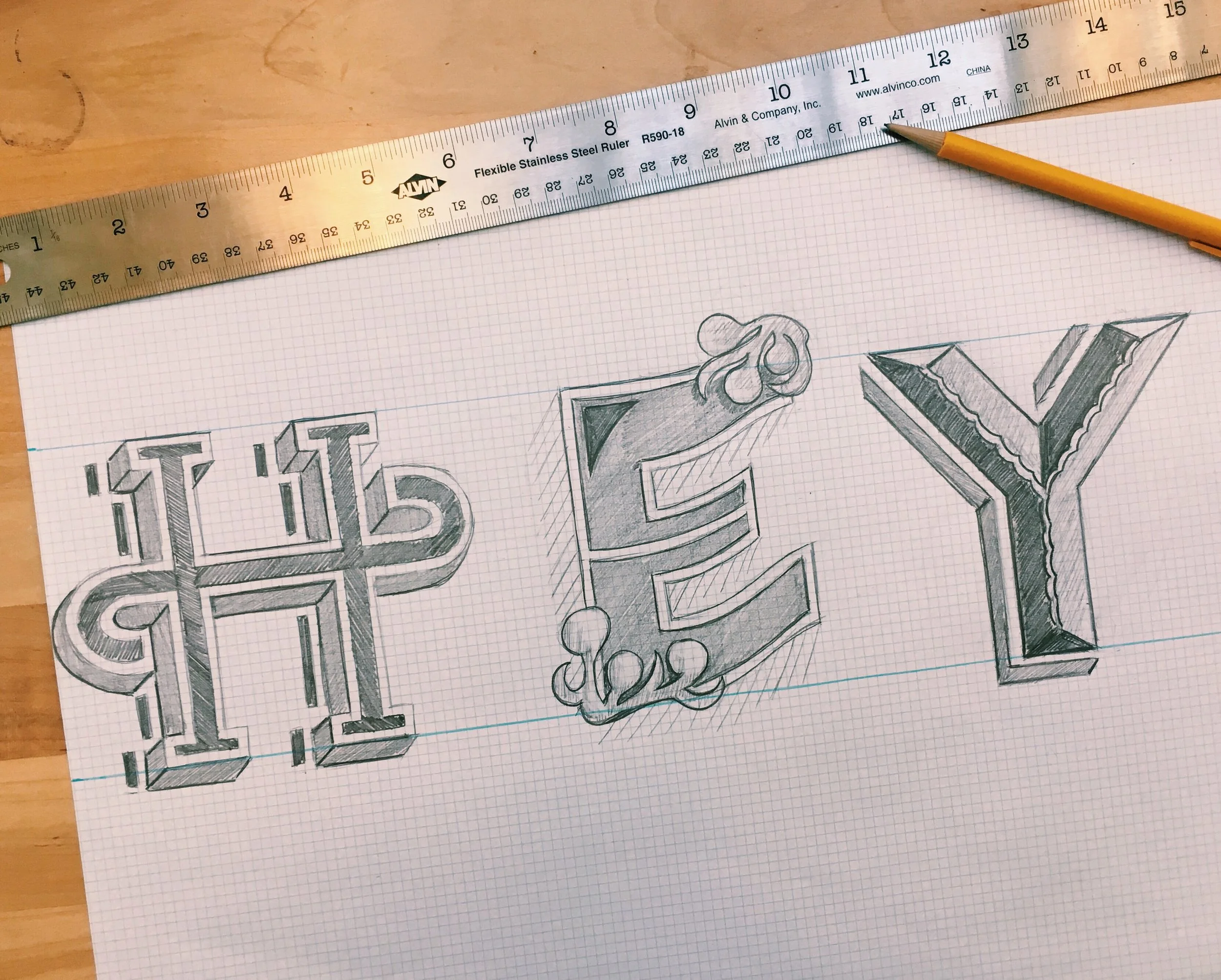
Many of these pieces begin as sketches and evolve through different materials and techniques, from paint and traditional drawing tools to unexpected mediums and surfaces. The process of building letterforms by hand helps me develop a deeper understanding of composition, rhythm, and visual storytelling.
Several of these projects were created in collaboration with brands or as part of larger creative initiatives, including work developed during my time with Disney Consumer Products and Brighton Collectibles. Others are personal explorations where I experiment with materials, scale, and unconventional approaches to lettering.
Together, these pieces reflect an ongoing curiosity about how typography can move beyond digital design and become something tactile, playful, and human.
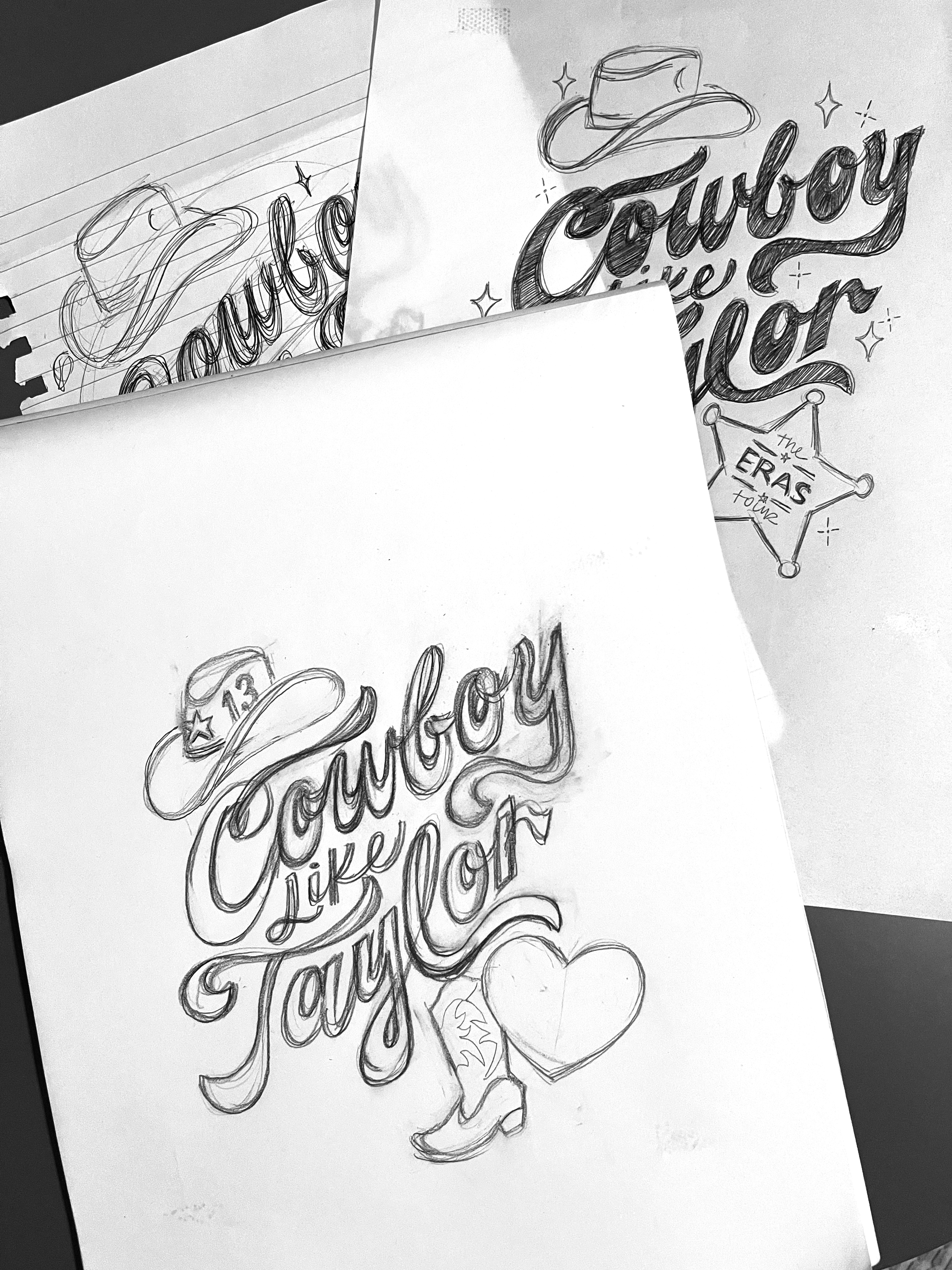

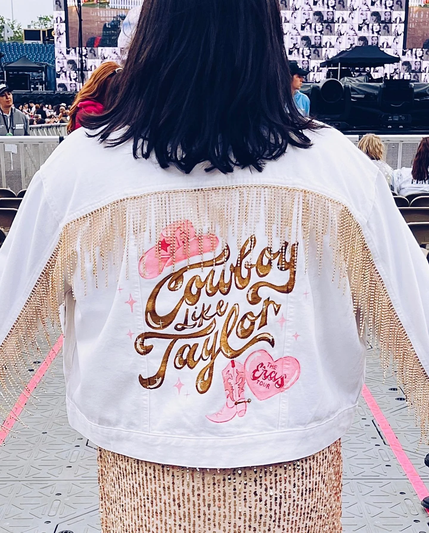
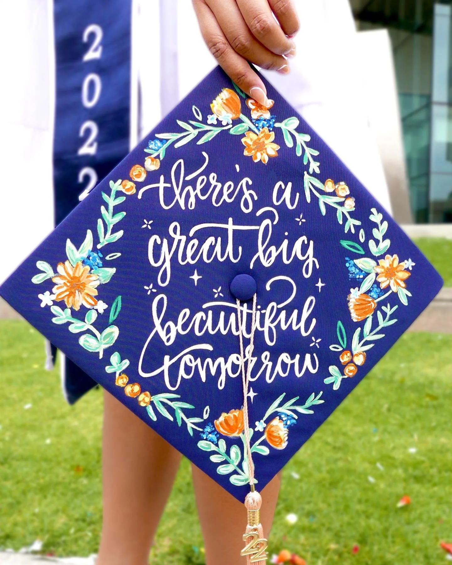
This piece was created as a personal exploration of hand lettering applied to wearable surfaces. The phrase “Cowboy Like Taylor” was first sketched and refined before being hand painted with acrylic paint on a denim jacket in preparation for The Eras Tour.
The project explores how lettering can move beyond traditional print applications and become part of a tactile, expressive object.

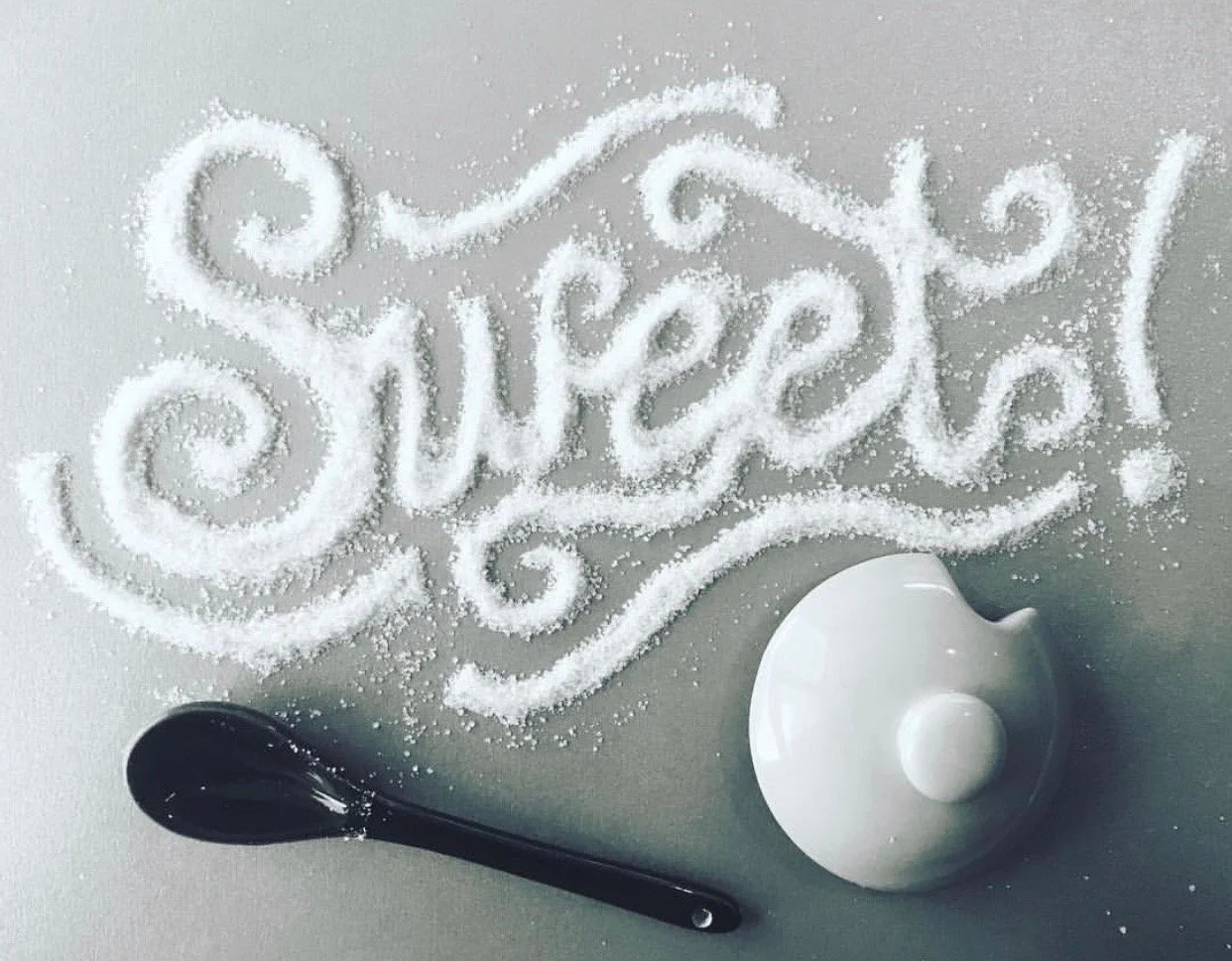
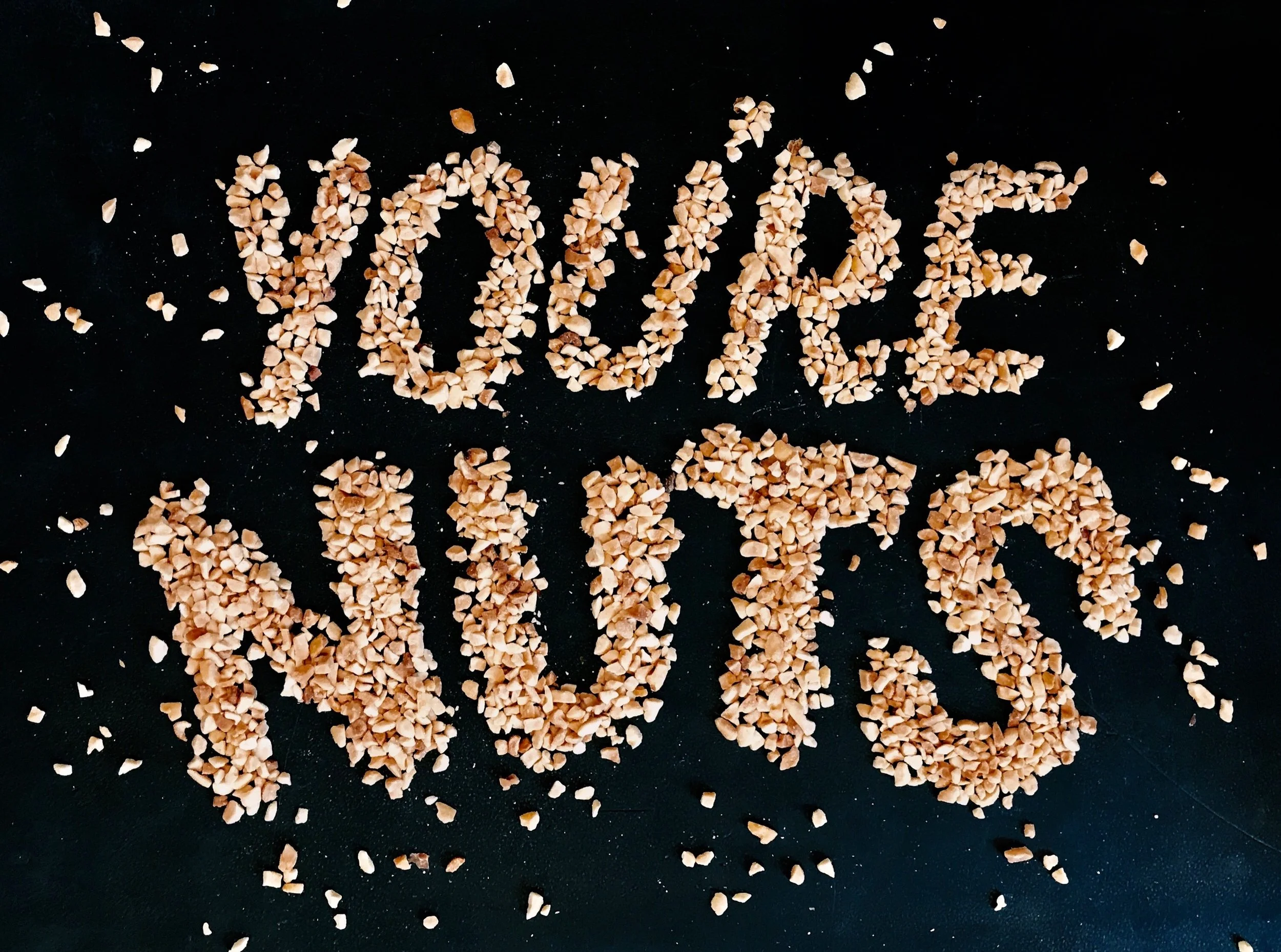
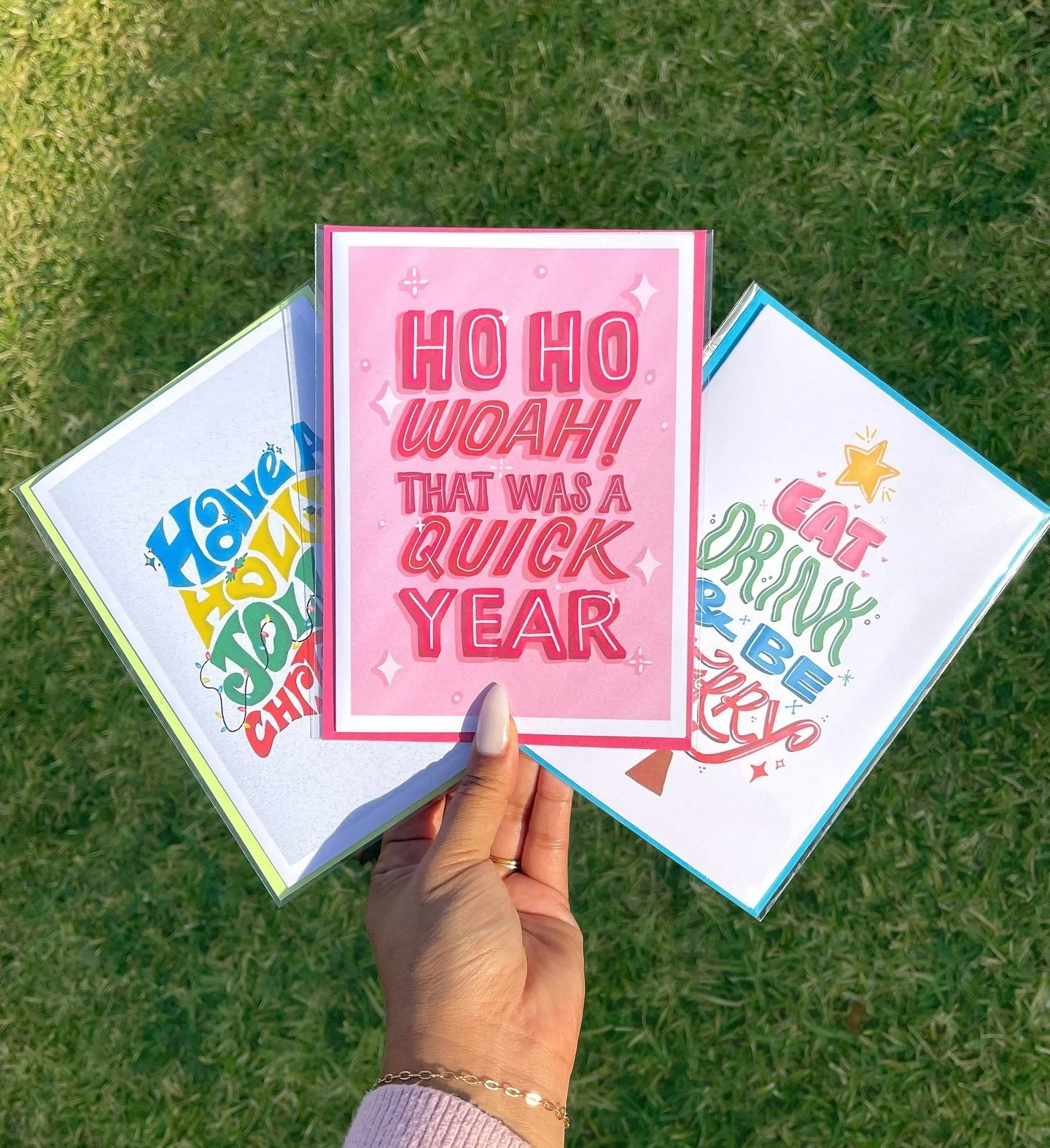
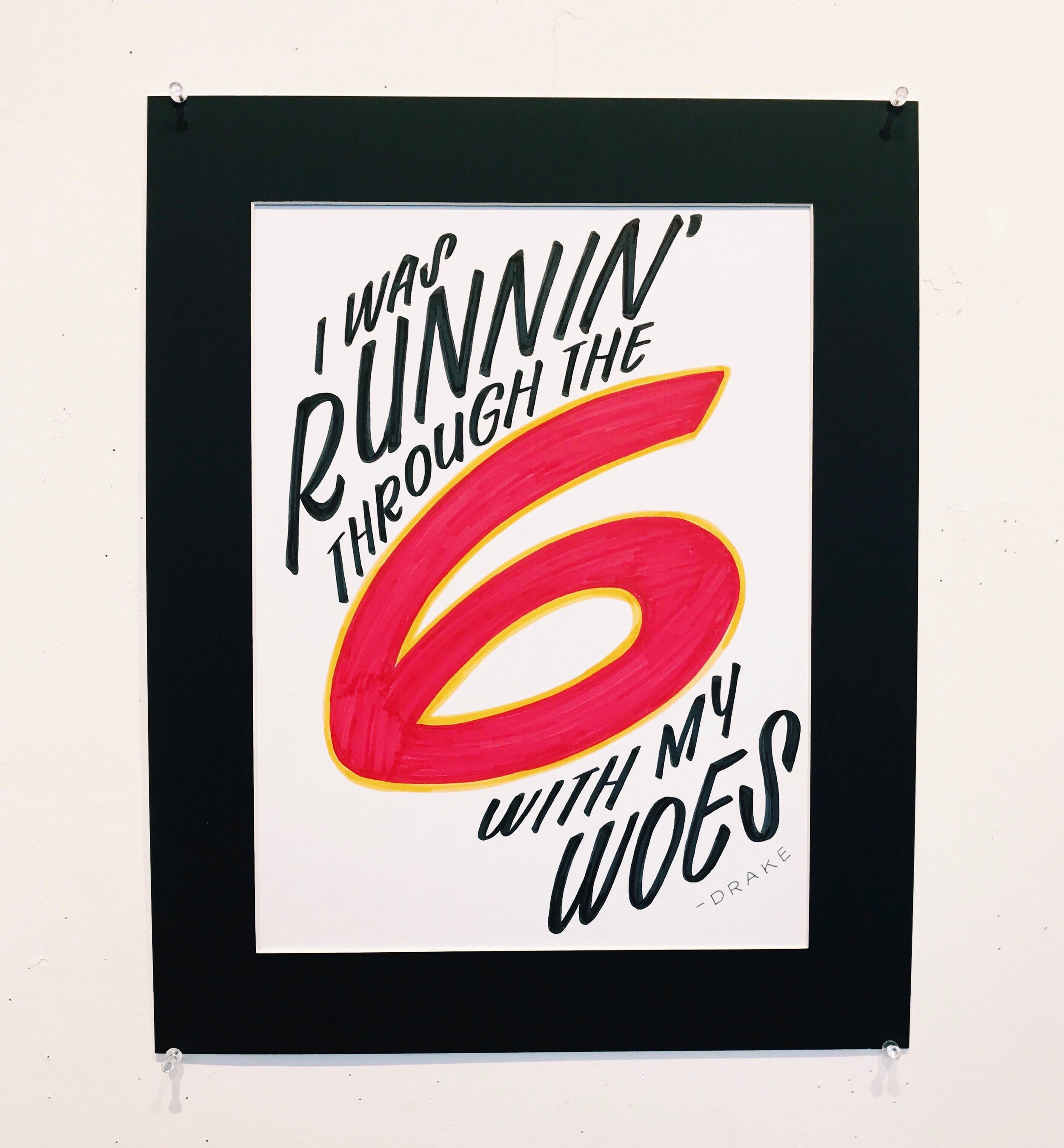
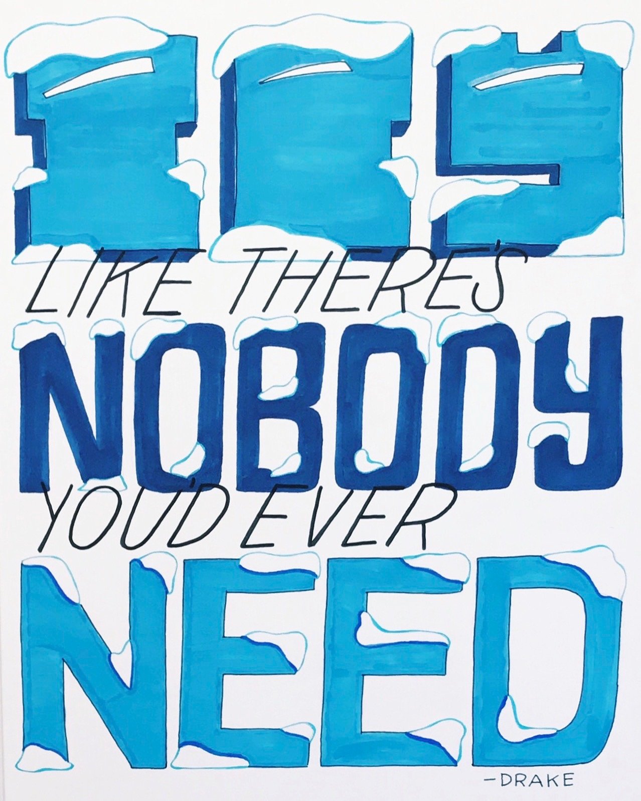
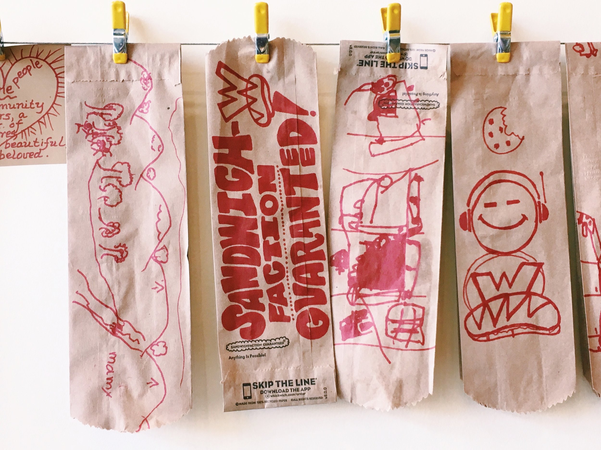
Many of my lettering explorations begin with curiosity about materials and process. I often experiment with unconventional mediums to see how typography can take shape in unexpected ways.
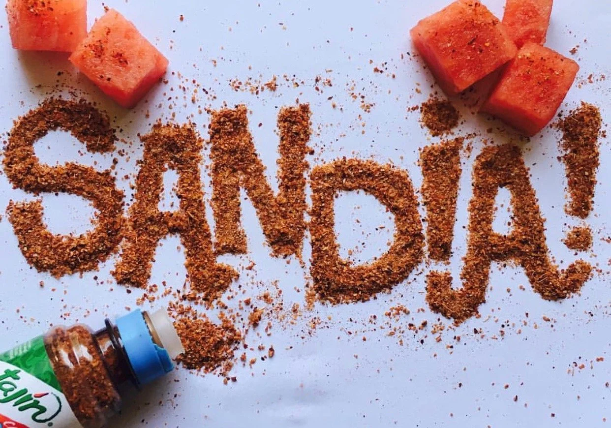
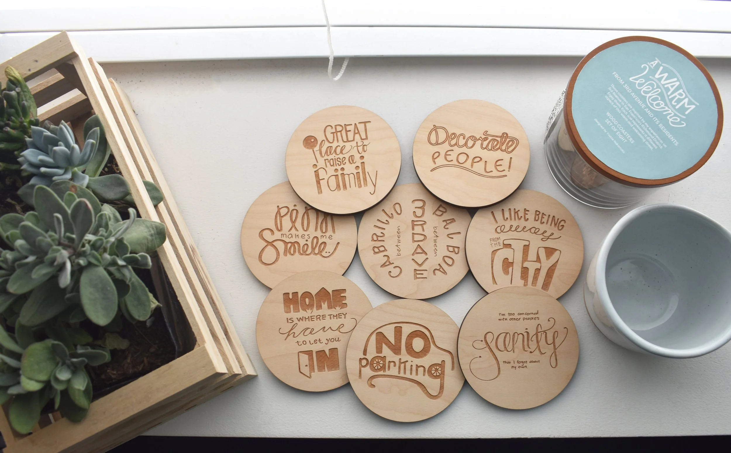
These playful experiments allow me to study form, spacing, and composition while pushing lettering beyond the screen. One piece, Sandia, was recognized by Tajín Mexico on X (formerly Twitter), highlighting how experimentation can lead to work that resonates widely.
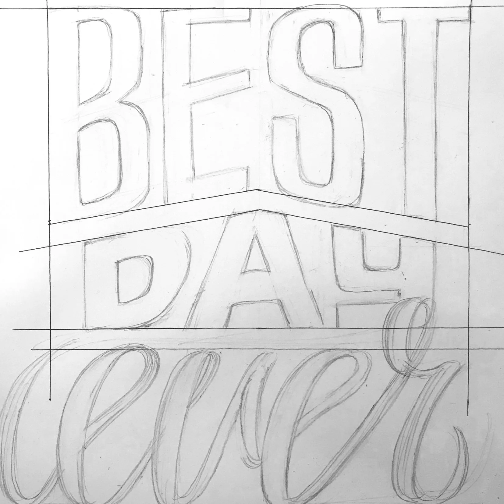

Best Day Ever was developed during my time at Disney Consumer Products as part of a floral-inspired style guide. The lettering was designed to feel energetic, optimistic, and aligned with the tone of Disney’s character-driven storytelling while remaining adaptable across multiple design applications.


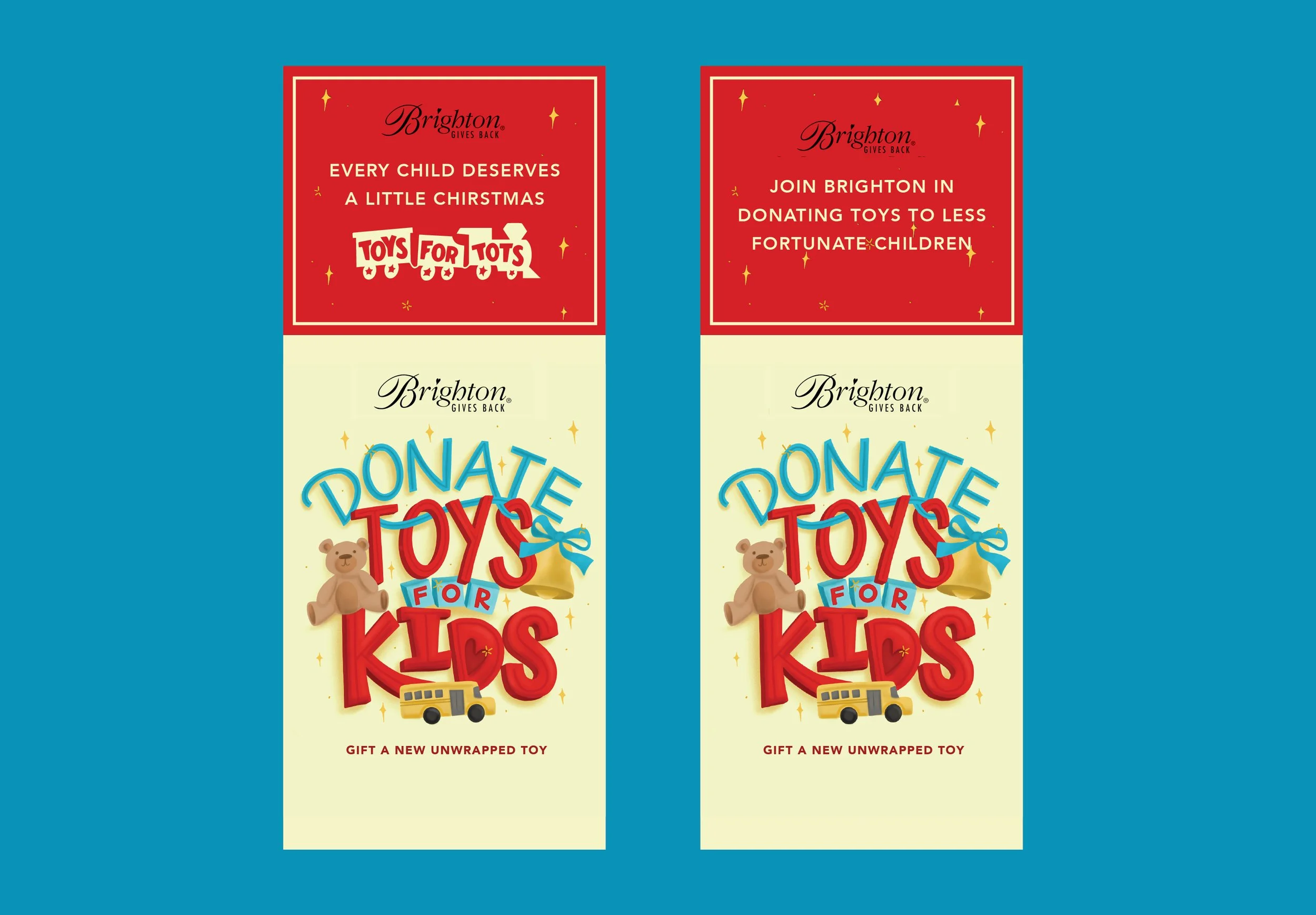
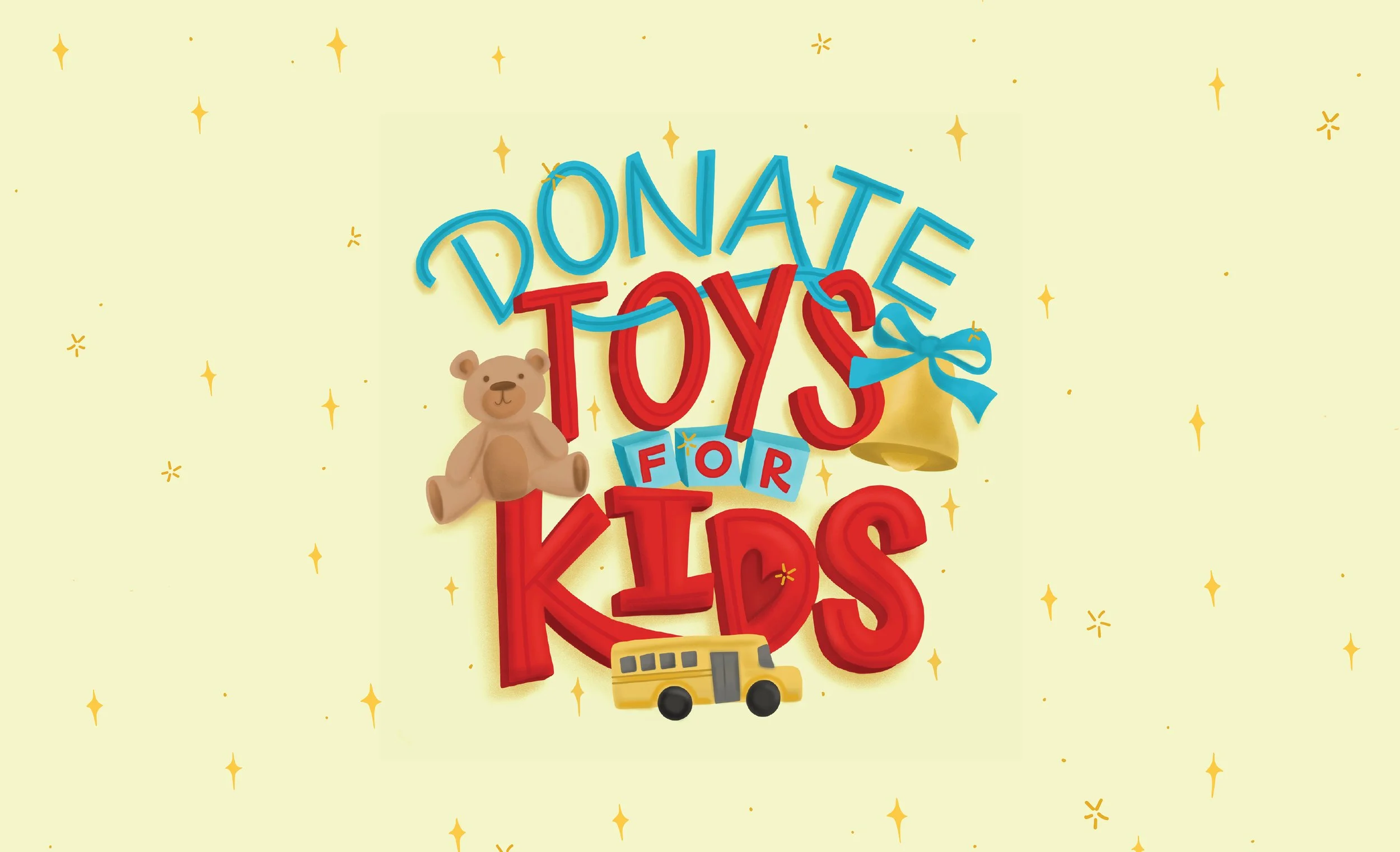
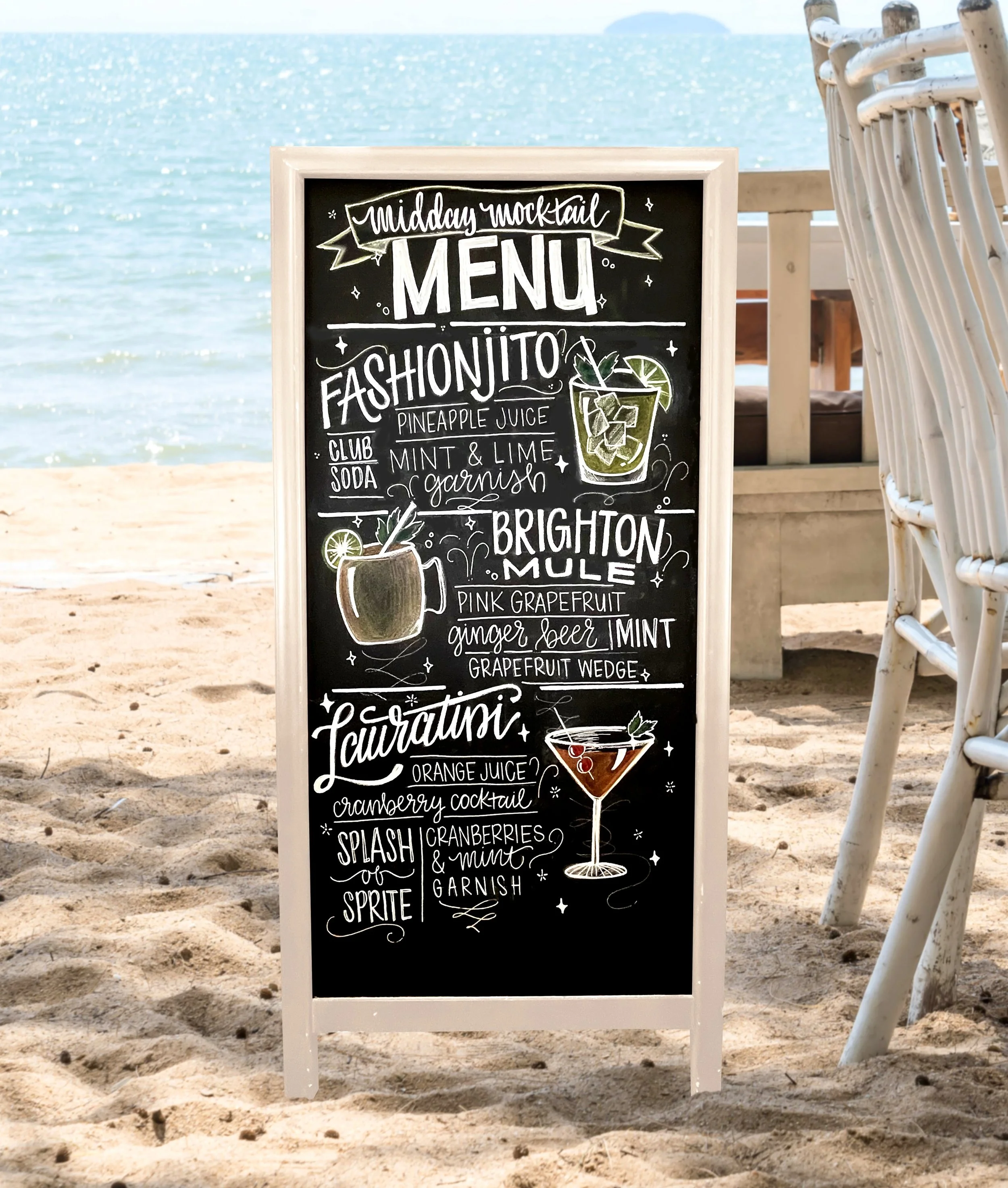
This hand-lettered box was created for a Brighton Collectibles holiday initiative in collaboration with Toys for Tots. The piece was displayed in over 200 Brighton retail locations, encouraging customers to participate in the donation program throughout the season.
The project demonstrates how hand lettering can add a personal, welcoming touch to in-store experiences while supporting meaningful community initiatives.


During a sign painting workshop in Los Angeles led by Heather Hardison, I studied traditional sign painting techniques using One Shot paint. The class focused on the fundamentals of brush control, letter structure, and spacing, skills that continue to influence my lettering practice today.


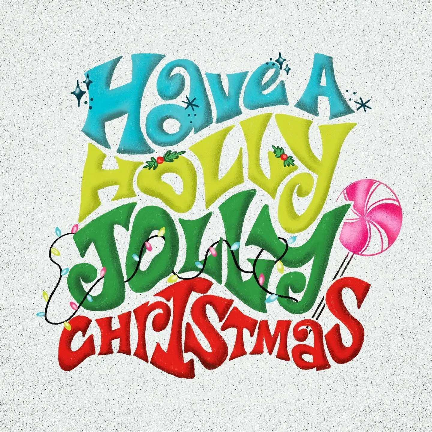
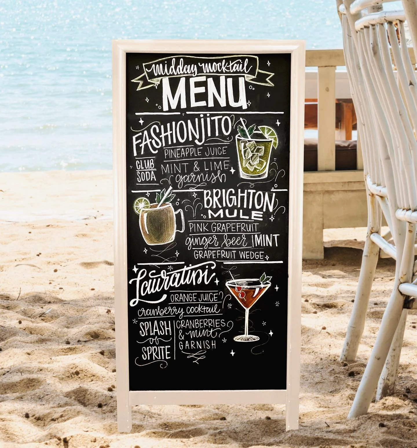
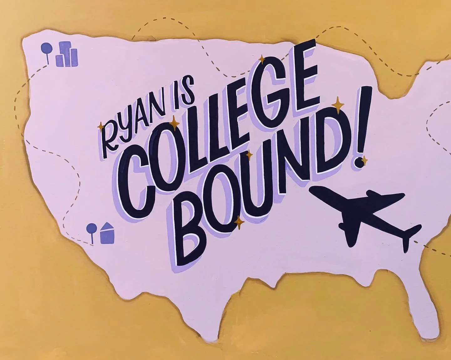
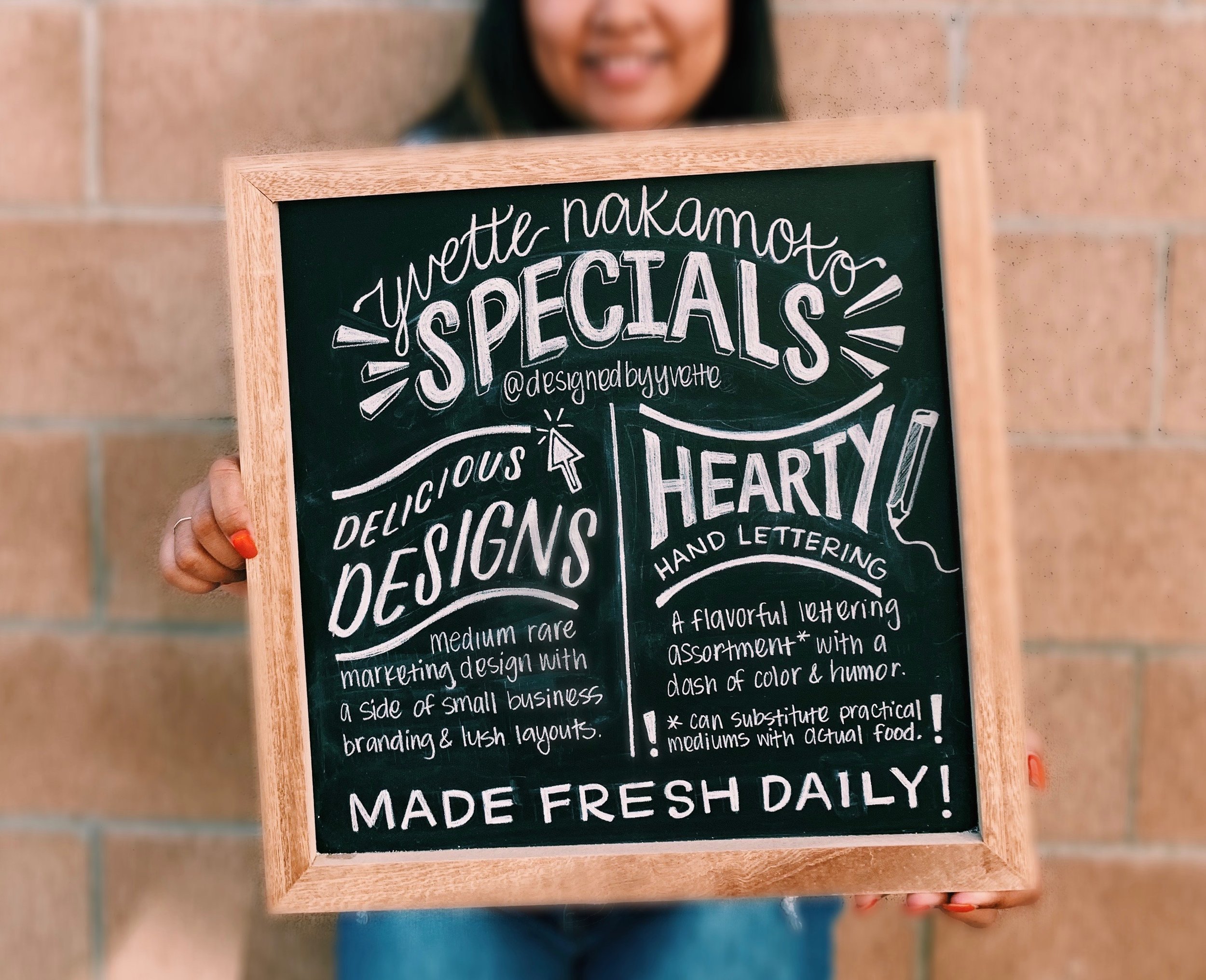
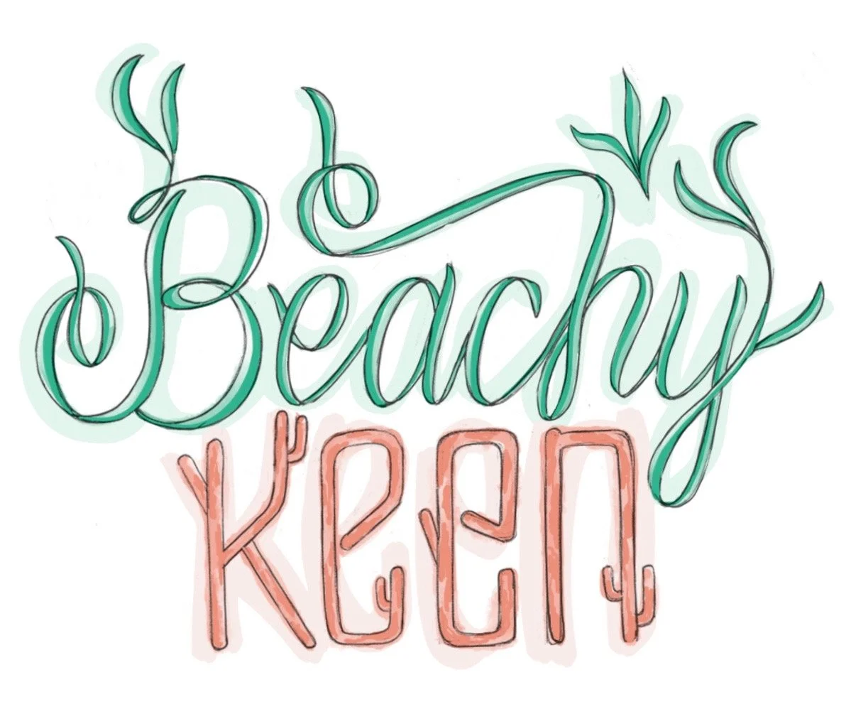
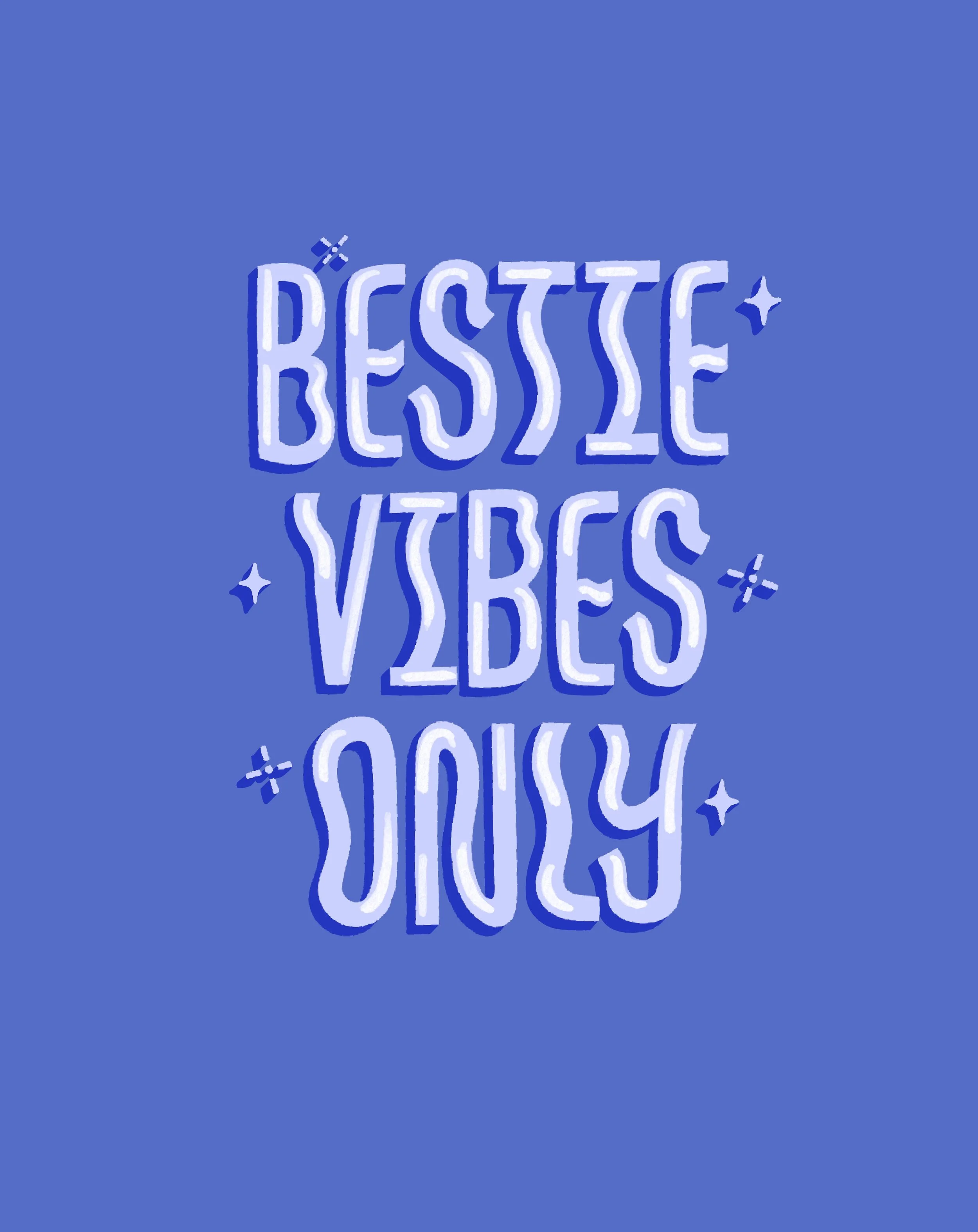
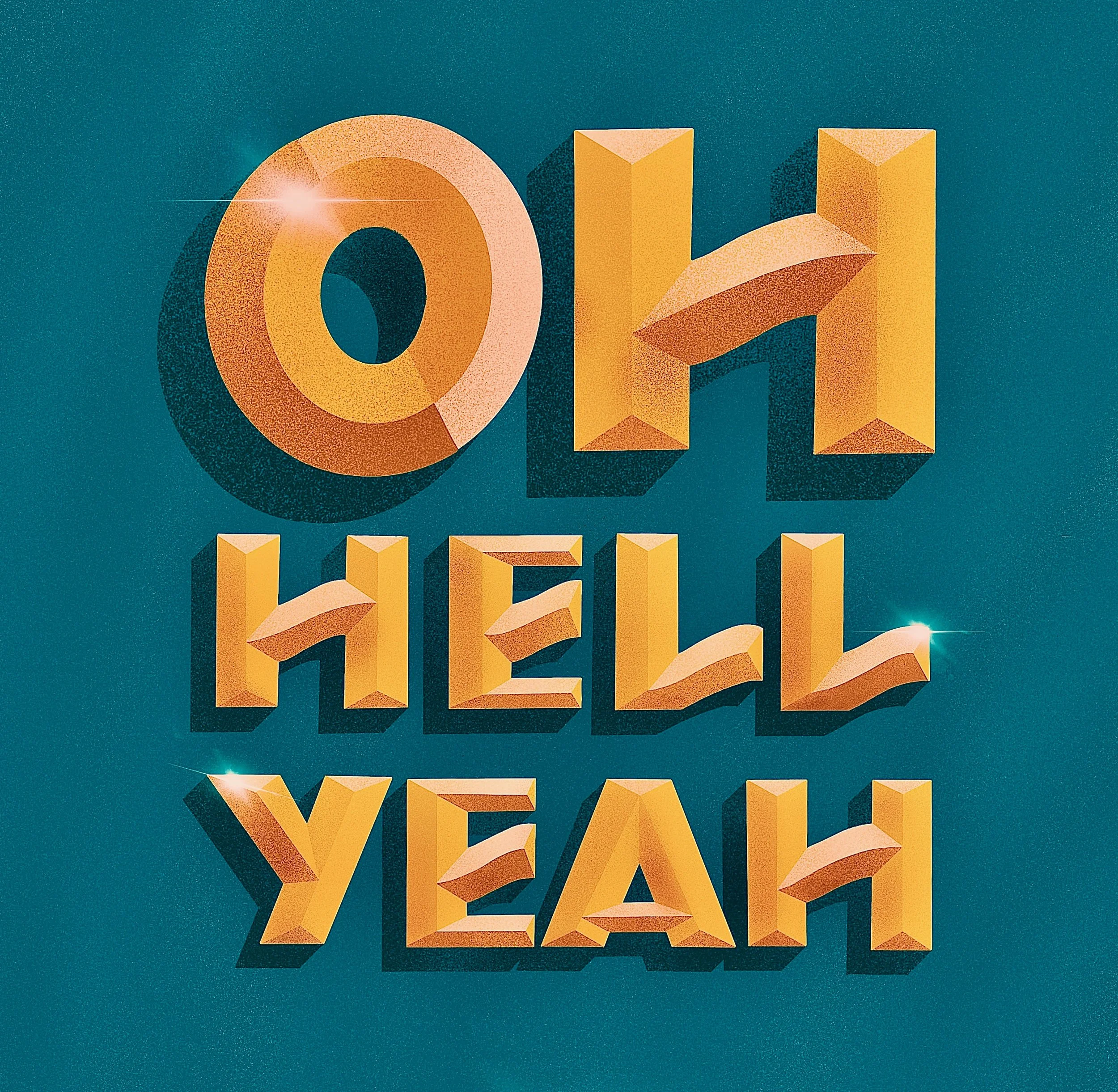
A few additional lettering explorations and personal favorites.


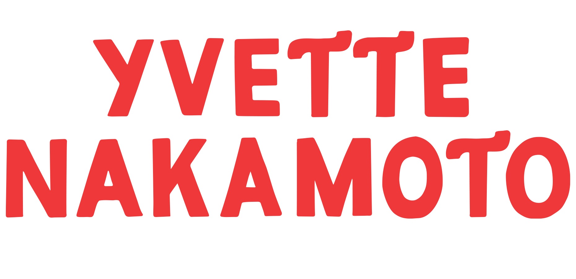
View more on Instagram @designedbyyvette