The Art Of
Mixed Metals
Overview
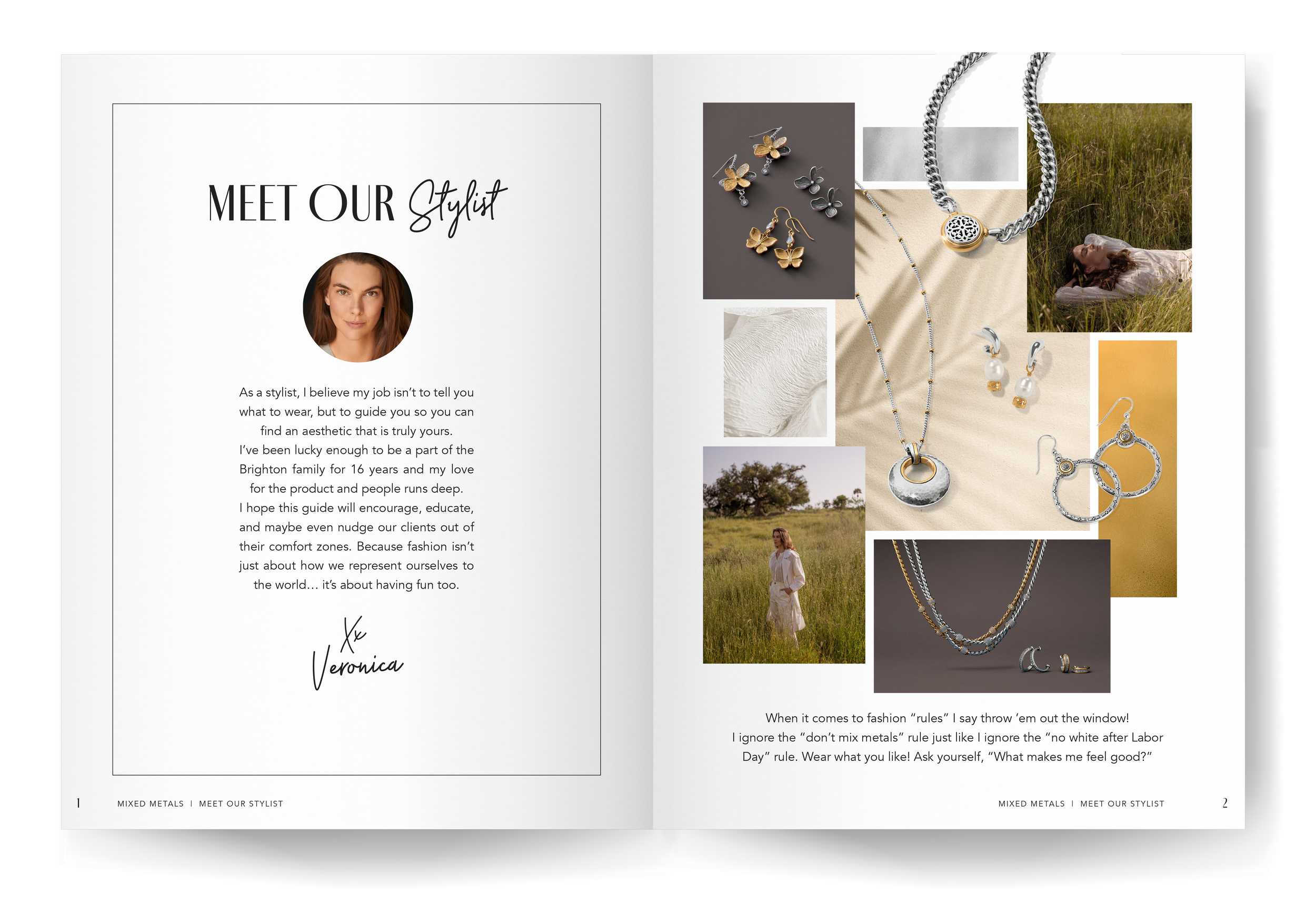
The Mixed Metals handout was designed to showcase Brighton Collectibles’ signature mixed metal jewelry collection while inspiring customers to confidently style silver and gold together. The publication combines product storytelling with styling guidance to help customers explore new ways of wearing the brand’s pieces.
Role
Led the layout design, typography, and visual direction of the publication as part of Brighton’s consumer-facing marketing materials.
Approach
The design balances editorial storytelling with clear product presentation. I developed a clean layout system that highlights the contrast between silver and gold while guiding the reader through styling tips and curated product groupings. Careful attention was given to hierarchy, pacing, and visual rhythm to ensure the piece felt both informative and aspirational.
Outcome
The Mixed Metals handout became a well-loved in-store resource that encourages customers to experiment with styling combinations, supporting product discovery and contributing to increased engagement with the collection.
Client: Brighton Collectibles